William Morris Botanical Prints: A Styling Guide for the Modern Home
Written by Iris
There is something about a William Morris print that makes a wall feel more like home. The repeating leaves, the curling vines, the deep mossy greens and faded rose pinks. They look like a Victorian garden caught in mid-bloom, and yet they sit happily in a modern kitchen, a contemporary bedroom, even a beach house on the coast. After more than a century, Morris's botanicals are still some of the most loved prints in the world, and there is a good reason for that.
I want to share what I have learned over the years about how to style these pieces in a home that is not Victorian. If you have been saving William Morris prints to a Pinterest board and wondering whether they will actually work in your space, this is for you.
A Few Words on William Morris
William Morris (1834 to 1896) was an English designer, poet, and craftsman who became one of the leading voices of the Arts and Crafts movement. He believed in beauty in everyday life, in handmade quality over machine-made shortcuts, and in nature as the great source of design. His wallpapers and textiles, almost all built on botanical themes, are still in production today through Morris and Co.
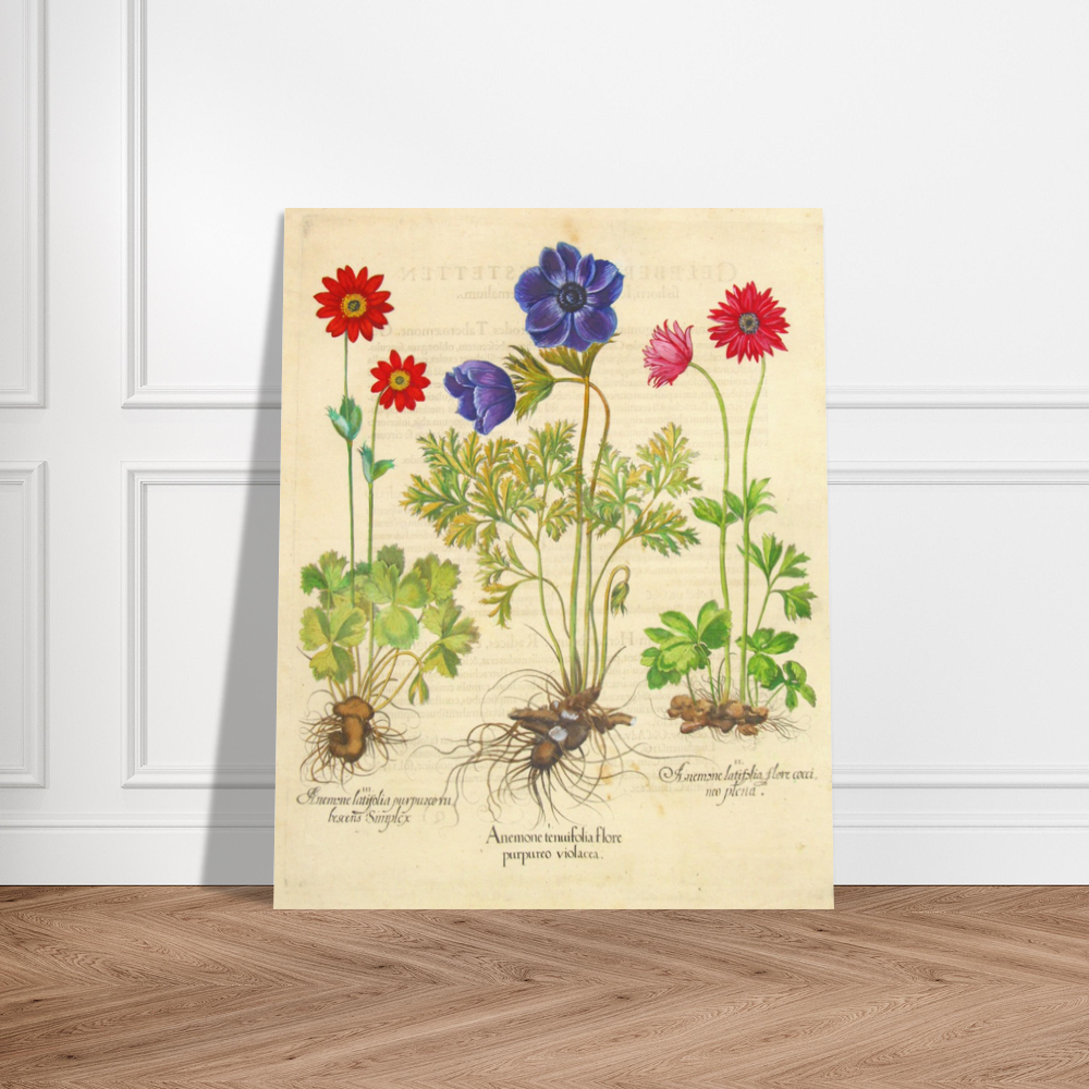
What we offer at Antiquarian Print Shop is a beautifully reproduced collection of Morris's botanical artworks, printed on quality paper and ready for the wall. They are reproductions, clearly labelled, faithful to the originals, and a fraction of the price of the framed antique pieces. Perfect for anyone who loves the Morris look without the price tag of a museum piece.
Take a wander through the William Morris Collection if you want to see what we have available.
Why Morris Still Works in Modern Interiors
A common worry I hear is that Morris feels too "Victorian," too busy, too formal for a modern home. The opposite is true.
Morris's patterns were designed to feel like nature itself: organic, layered, never sterile. That is exactly what most modern interiors are missing. Clean white walls, minimalist furniture, and contemporary architecture create beautiful blank canvases that crave one rich, story-led piece of art to soften them. A Morris print is one of the easiest ways to give a modern room a sense of depth and warmth without making it feel old-fashioned.
I have seen Morris botanicals hung beside concrete benchtops, above mid-century sideboards, and in stark white Hamptons coastal bedrooms. Every time, they look like they have always belonged there.
Five Things to Think About Before You Hang One
1. Match the Colour to the Room
Morris worked in a beautiful but defined palette: deep greens, mossy olives, soft blues, faded reds, warm golds, and creamy backgrounds. Start by looking at the dominant colours already in the room.
If you have a lot of cool tones (greys, whites, soft blues), a piece with deep blues and greens will feel restful and intentional. If you have warm tones (oak floors, brass fittings, terracotta), the Morris reds and golds will sing. There is no wrong choice, only choices that work harder or less hard for the room.
2. Get the Scale Right
This is where most home stylers come unstuck. A small print on a big wall looks lonely. A big print on a small wall feels crowded.
A simple guide: the framed print should fill roughly two-thirds of the visual space above whatever it is hanging over (a sofa, a bed, a sideboard). If the sofa is two metres wide, the framed print should be around 130 centimetres wide, or you should use two or three smaller prints grouped together to fill the same visual width.
When in doubt, go slightly bigger than feels safe. Modern walls tend to be larger than people realise, and tiny art floats on them.
3. Decide: One Statement or a Gallery
You have two beautiful choices with Morris.
The single statement piece treats one large framed botanical as the focal point of the room. Hang it on the wall directly opposite the entrance to the room, so the print is the first thing the eye lands on. This works particularly well in dining rooms, bedrooms, and reading nooks.

The gallery wall uses three to seven smaller prints in a grouping. All the same artist, all the same framing, varied in size or all the same. A Morris gallery wall is one of the most calming installations you can create in a home because the patterns share a visual language. They sit together without competing.
If you go gallery, my tip is to keep the framing identical (same profile, same colour) so the patterns themselves do the visual work, not the frames.
4. Choose Your Frame Carefully
For Morris botanicals, three frame styles tend to land best in modern homes.
A simple oak or natural timber frame with a generous off-white mat is the most flexible choice. It works in almost any style of room and lets the print speak.
A black frame with a slim profile suits modern minimalist rooms and gives the Morris print a slightly more contemporary edge.
A gold or warm brass frame brings out the warm tones in the Morris palette and works beautifully in homes with vintage or eclectic styling.
I would steer clear of heavy ornate gold frames unless the rest of the room can carry them. Morris's patterns are already rich. The frame should be a quiet companion to the art.
If you would like to order a William Morris reproduction already framed, we offer that service at Antiquarian Print Shop. Our framed Morris pieces have become one of our most popular lines, and they arrive ready to hang. No trip to the framer, no measuring, no fuss.
5. Think About the Room First, the Print Second
One thing I see often is people choosing the print first and then trying to make a room work around it. Reverse it. Look at the room you want to style, decide what feeling you want it to have (restful, energising, romantic, grounding), and then choose the Morris piece that delivers that feeling.
A bedroom usually wants restful and soft, so the blue and green Morris pieces tend to be best. A dining room can take more drama, so the deep reds and golds come into their own. A bathroom or laundry can take a bold statement because you are in there briefly and the impact lands fast.
A Few Room Ideas to Spark Yours
Above the bed. A single large framed Morris piece in a soft palette (greens, blues, creams) directly above the bedhead. Hung centrally. Roughly the width of the bedhead, or slightly narrower.
Above the dining table. A large statement piece or a gallery of three medium prints on the wall behind the main seating side of the table. Anchors the room.
In the entry hall. A single tall Morris piece beside or above a console table. Sets the tone the moment someone walks in.
In the kitchen. Yes, the kitchen. A framed Morris on the wall opposite the cooktop or above a butler's pantry adds warmth to a space that often feels purely functional.
In a child's bedroom or nursery. The softer Morris pieces (the Loddon, the Iris, the Honeysuckle) have a gentle storybook quality that suits children's rooms beautifully and grows up with them.
How to Start
If you are still deciding which Morris piece is the right one for your space, take a slow wander through the William Morris Collection. You can filter by colour palette and by piece size. We can frame any piece in your choice of finish before it ships, and most framed orders go out same day.
And if you want a second opinion on which piece would work in your specific room, write to me. Send a photograph of the wall and a quick description of the room, and I will be glad to talk it through with you. There is no obligation. I love this part of the work.
Happy browsing!
Iris