
Are Antique Prints and Maps Worth Displaying at Home?
Last Updated: November 1, 2026
Quick Summary
Yes, an antique print is worth displaying at home if you choose and place it with care. Its original engraving often has more character than mass-produced art, and one well-placed map or print can anchor a whole room. Hang it away from direct sunlight and heat sources to protect the paper.
- Hang the centre of a print at about 150 cm from the floor.
- Leave roughly 15 to 20 cm between furniture and the bottom of the frame.
- Keep a single piece to about 50 to 75 per cent of the furniture's width.
- Never hang an antique print above a radiator, fireplace or heat pump outlet.
- Use acid-free mats and UV-filtering glazing if the print hangs near a window.
Table of Contents
- Choosing Antique Prints and Maps for a Room
- How to Display Vintage Pictures in a Room
- Antique Print Gallery Wall Ideas
- How to Frame Antique Prints
- Protecting Antique Prints From Sunlight
- Mixing Antique Maps and Prints With Modern Décor
- Choosing Your First Antique Print for Your Room
- Frequently Asked Questions
Antique prints and maps are a question many homeowners ask: are these pieces worth hanging at home? For more practical display ideas, see styling vintage art in modern homes. The answer is yes, but only if you choose and display them with care. An original engraving can carry more character than any mass-produced canvas, and a single well-placed map can anchor a whole room. Antiquarian Print Shop's collection includes botanical, bird and fashion illustrations, plus maps, and custom print options are available in multiple sizing formats. This guide walks through how to pick the right pieces, arrange them, protect them and mix them with contemporary furniture.
Choosing Antique Prints and Maps for a Room
Start with the room, not the artwork. A small study suits a single print at eye level, while a dining room can carry a larger map or a set of matching botanicals. Measure the wall first and note its colour, since warm tones flatter aged paper and cool greys can make it look washed out.
Botanical, bird and fashion illustrations
Botanical plates are the safest choice for most homes because they sit comfortably with almost any décor. Bird illustrations add a touch of life and movement, and they work well in bedrooms and reading nooks. Fashion illustrations suit a dressing room, hallway or living space where you want a little glamour.
Each category has its own mood:
- Botanicals: calm, classic, easy to match with greenery and wood
- Birds: lively, natural, good for quiet corners
- Fashion: bold, stylish, ideal for hallways and entrances
Originals versus reproductions
An original antique print is a historical object in its own right, printed from a plate or stone in an earlier era. A reproduction recreates the image, often for a lower price. Originals suit collectors and anyone who values age and provenance, while reproductions give you the look of an iconic image on a smaller budget.
Be clear about which you are buying. Ask for the printing technique, date and condition before you pay.
How to Display Vintage Pictures in a Room
Hang a print so its centre sits at about 150 cm from the floor, which is a common guideline for eye level. Above a sofa or console, leave roughly 15 to 20 cm between the furniture and the bottom of the frame. Use painter's tape on the wall to test the layout before you drill any holes.
Size the art to the wall and the furniture
Many people place a single print too small on a large wall. Scale up. A print that looks big in a shop often looks right at home once it is framed with a generous mat. As a working rule, a single piece should occupy roughly 50 to 75 per cent of the width of the furniture below it, a print above a sofa should span most of the sofa's width, not sit as a small square in the middle.
For a large blank wall with no furniture beneath, a single small print will always look lost. Either choose a larger map or group three to five prints so the arrangement holds the wall.
Room-by-room placement
- Living room: Anchor the main seating with one large map or a gallery group above the sofa. Keep the bottom edge 15 to 20 cm above the sofa back.
- Bedroom: Hang a single print or a pair centred above the bedhead, with the bottom edge about 15 to 20 cm above the headboard. Bird and botanical prints suit the quieter mood.
- Hallway: Use a vertical column of fashion or botanical prints where wall width is limited, and keep the centre line consistent down the run.
- Home office: A detailed antique map works well behind or beside the desk, where its fine engraving rewards close viewing. Avoid hanging it where a monitor or lamp will cast glare across the glass.
Control the light
Direct sunlight is the biggest threat to antique paper, so placement and lighting go together. Hang prints away from south- and west-facing windows where the sun lands for hours each day, or specify UV-filtering glazing when you frame. If a picture light is part of the scheme, choose a low-heat LED fitting and angle it so the beam grazes the surface rather than hitting it straight on, which reduces glare and evens out the illumination across a large map.
Test before you commit
Tape paper templates at the exact frame size to the wall and live with them for a day. Check the height from the main viewing position, standing in a hallway, sitting on the sofa, lying in bed, because the correct centre height shifts with how the room is used. Only drill once the template looks right from the place you will actually see it.
Antique Print Gallery Wall Ideas
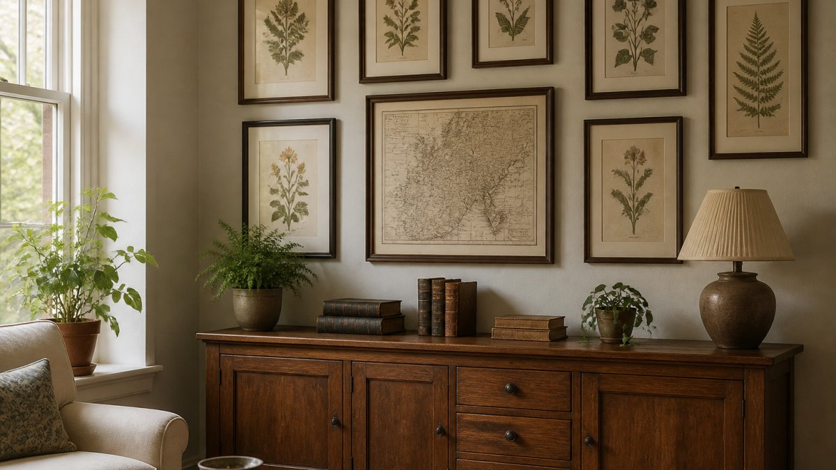
A gallery wall lets you mix several antique prints into one display, but the difference between a considered arrangement and a jumble comes down to measurement and a consistent visual thread. Treat the group as a single composition: the eye should read it as one piece, not as a collection of unrelated frames.
Plan the layout before you drill
Lay the prints out on the floor first, or tape paper templates to the wall at the exact frame sizes. Start with the largest piece as the anchor, then build outward with smaller works. A common pattern is to place the anchor slightly below the centre of the group so the arrangement feels grounded rather than top-heavy.
Keep 5 to 8 cm between frames for a tidy, traditional look. Wider gaps of 10 to 15 cm suit a looser, more contemporary arrangement, but pick one gap size and repeat it throughout, inconsistent spacing is the most common reason a gallery wall looks unresolved.
Map, Speed John, Montgomery Shire, c1610 →
Size the group to the wall and the furniture
A gallery wall should occupy roughly 60 to 75 per cent of the width of the furniture below it. Above a sofa, for example, the group should span most of the sofa's width rather than floating as a small cluster in the middle. The bottom edge of the lowest frame should sit about 15 to 20 cm above the sofa back or console top, and the centre of the whole group should land near 150 cm from the floor.
If you are working with a narrow hallway, a single vertical column of three or four prints often works better than a wide grid, because it draws the eye along the space without crowding the walls.
Mix maps, botanicals and fashion prints with intent
Mixing a map with botanicals and a bird print creates interest because each image has a different texture and tone, but the mix needs a unifying element. Keep the frames in a consistent finish, black, natural oak or gold, so the eye reads the group as one piece. Alternatively, unify by colour: choose prints that share a muted palette of greens, ochres and creams, which is common across antique botanical and map plates.
Fashion illustrations deserve special mention here. A set of three or four couture or advertising prints in matching frames makes a strong, cohesive gallery wall for a dressing room, hallway or living space, and the vertical format of many fashion plates suits a column arrangement.
Renter-friendly and damage-minimising options
If you cannot put holes in the wall, adhesive picture strips rated for the weight of each frame are a practical alternative, though they work best on smooth, painted surfaces and should be tested on an inconspicuous patch first. For heavier framed maps, a picture rail or a freestanding leaning arrangement on a console or shelf avoids wall damage entirely and suits a relaxed, contemporary look.
How to Frame Antique Prints
Framing protects the print and sets its mood. Choose acid-free mats and backing boards, because cheap card can yellow paper over time. Use a glass or acrylic glazing with UV protection if the print will hang near a window.
Watch out: never fix an antique print directly to the glass with tape, since adhesive can damage the paper. To judge the finished look, you can view a framed bird print as an example. Ask your framer to hinge the print with conservation-grade materials instead.
Protecting Antique Prints From Sunlight
Direct sunlight is the biggest threat to antique paper. It fades inks and causes yellowing over time. Hang prints away from south- and west-facing windows where the sun lands for hours each day, or use UV-filtering glazing.
Rotate displayed pieces every so often if you cannot avoid strong light. Keep the room at a steady temperature and avoid damp walls, since humidity can cause foxing and mould.
Mixing Antique Maps and Prints With Modern Décor
Antique maps and prints look striking next to modern furniture. A clean-lined sofa, a simple lamp and a plain rug let the artwork speak. Maps work especially well in offices and studies, where their detail suits a considered space.
An antique map, for example, adds colour and a conversation point in a dining room. You can browse an antique French wine map reproduction to see how one looks as a décor piece. Check the scale of each piece against your furniture so it does not feel lost or overpowering.
Choosing Your First Antique Print for Your Room
Begin with one piece you genuinely love and a clear spot to hang it. If a bird illustration suits your room, you can browse a botanical bird print and see how it fits your space. Set a modest budget and look for a print in good condition with a clear date and technique. Avoid buying solely for investment unless you understand the market, and choose something you will enjoy looking at every day.
| Choice | Best for | What to check |
|---|---|---|
| Botanical print | Living rooms and dining rooms | Plate clarity, colour |
| Bird print | Bedrooms and reading nooks | Condition, paper tone |
| Antique map | Studies and offices | Scale, borders, hand colouring |
| Fashion illustration | Hallways and dressing rooms | Print technique, date |
Once you have found your first piece, explore the Antiquarian Print Shop collection to compare originals and reproductions. Start with one wall, see how the piece sits in the room, and build from there.
Frequently Asked Questions
How do you display antique prints and maps at home?
Start by choosing a room with stable, moderate light and a wall that gets little direct sun. Hang prints at eye level, roughly 150 to 160 centimetres from the floor to the centre of the frame, and group maps and prints around a single focal point such as a sofa or a console table. Use a tape measure and paper templates taped to the wall to test layouts before drilling. Antiquarian Print Shop's collection, including its hand-coloured county maps, suits this kind of grouped display.
What frame works best for antique prints?
A simple timber frame with a wide off-white or cream mount usually suits antique prints best, because the mount separates the paper from the glass and draws attention to the image. Avoid tight mounts that touch the printed area and glass that is not UV-filtering. For fragile or valuable pieces, ask a framer for acid-free mounting materials and conservation glazing. Frame choice should suit the age and colour of the print rather than trend.
How can you protect antique prints from fading?
Keep prints out of direct sunlight, since ultraviolet light is the main cause of fading and yellowing in old paper and hand colouring. Use UV-filtering glazing, hang prints away from south- or west-facing windows, and rotate pieces periodically if you cannot avoid light. Keep humidity moderate and avoid bathrooms and kitchens, where moisture and temperature swings speed deterioration. Rehoming a print in a stable room is often the simplest protection.