
Is Hand Coloring on Antique Prints Original or Modern?
Table of Contents
- What Hand Colouring and Hand Tinting Mean
- How to Identify an Original Antique Print
- How to Tell If a Print Is Hand Coloured
- Original Colouring Versus Later-Added Colouring
- Antique Print Reproduction vs Original
- Dating the Colour Separately from the Print
- Frequently Asked Questions
Last Updated: October 17, 2026
What Hand Colouring and Hand Tinting Mean
Hand colouring is the practice of manually applying pigment to a printed image after the print has been made, and the question of whether is hand coloring on antique prints original or modern remains central to authentication. It differs from printing colour directly onto the plate or stone.
Historically, hand colouring served a practical purpose. Before colour printing became economical or reliable, artists and publishers hand-coloured prints to add visual appeal and market value. This was common practice for engravings, lithographs, and woodcuts from the 16th century through the 19th century.
The materials varied by period and artist. Early hand colouring often used watercolour, gouache, or diluted pigments applied with brushes. Some colourists used opaque pigment for bold coverage; others applied transparent washes that let the printed lines show through.
At Antiquarian Print Shop, we work with collectors and investors who need to distinguish original hand colouring from modern restoration or recolouring. The difference affects authenticity, value, and provenance. A print with original hand colouring from the 1830s commands respect and investment potential.
How to Identify an Original Antique Print
Before you assess whether colouring is original or modern, you need confidence that you're looking at an authentic antique print and not a modern reproduction. Identifying an original antique print requires examining several physical markers.
Understanding the Print Itself
An antique print is a work created through traditional printmaking methods, engraving, lithography, woodcut, or etching, and issued during or shortly after the artist's lifetime, typically before 1900. The print itself (the black or coloured image) was created by pressing paper against an inked plate, stone, or block.
The technique matters because each method leaves characteristic marks. An engraving or etching shows fine parallel lines where the artist's tool cut into the plate. A lithograph displays a grainy texture from the lithographic stone. A woodcut shows bold, direct lines with less detail. These technical signatures are difficult to fake convincingly.
Reproductions made in the 20th or 21st century often use modern offset printing or digital reproduction. These methods produce a different visual quality, sharper dots under magnification, more uniform ink coverage, and an absence of the subtle wear patterns that genuine old prints carry.
Examining the Plate Mark and Paper
Look for the plate mark, the embossed edge left by the printing plate pressing into the paper. On engravings and etchings, this mark is a raised line visible on the front and back of the paper. Run your finger across it gently, you should feel the texture. Lithographs typically do not have a plate mark because the stone surface is flat with the paper during printing.
The paper itself offers clues. Antique paper often shows age-related changes: slight yellowing, foxing (brown spots from oxidation), or a soft, slightly fragile texture. Modern paper is brighter and more uniform. Examine the paper under natural light and compare it to modern printer paper. The difference becomes obvious once you've seen both.
Watermarks in the paper, faint impressions visible when you hold the sheet to light, can help date the print. Paper makers included their mark or initials, and these marks are documented. If the watermark matches records from 1820-1850, that strongly suggests the print dates to that period.
How to Tell If a Print Is Hand Coloured
Determining whether colouring is hand-applied requires close visual inspection and understanding how hand colouring looks under magnification and different lighting.
Visual Tests for Hand-Applied Colour
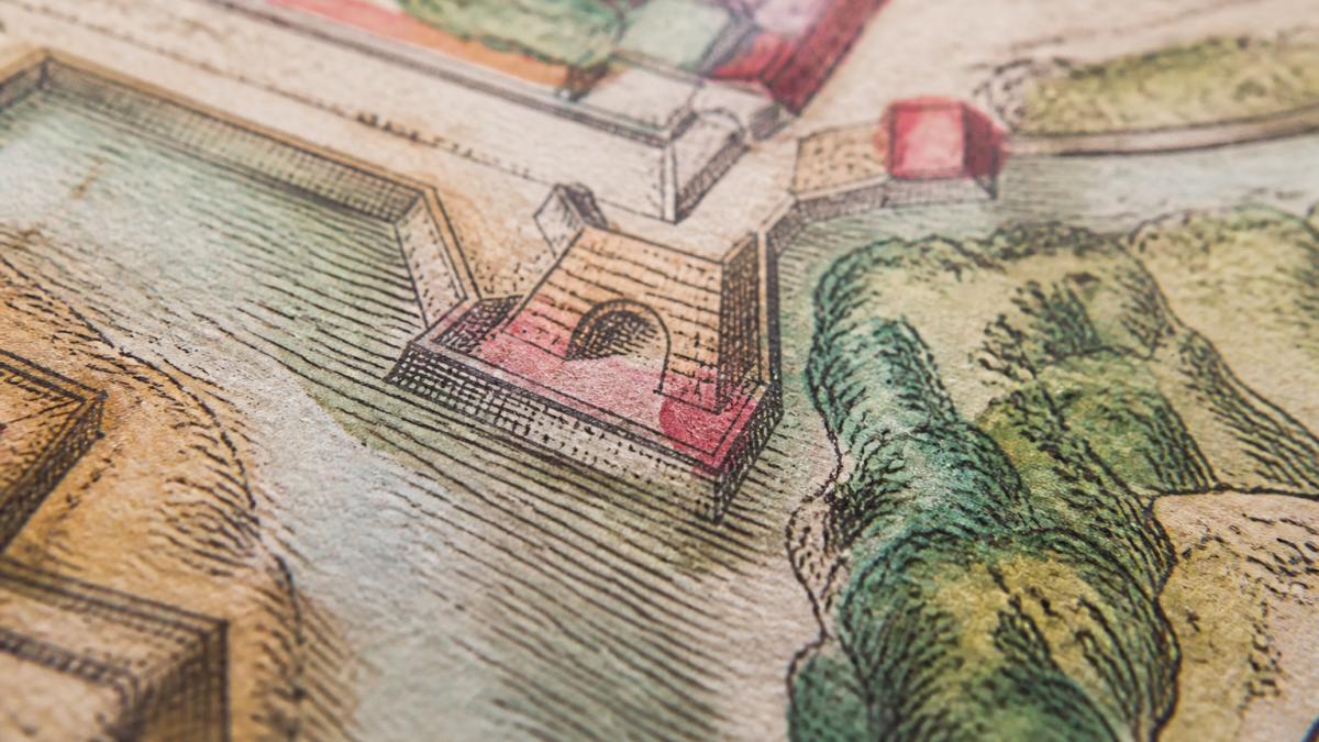
The first test is to examine the colour boundaries. Hand-applied colour rarely follows the printed lines perfectly. You'll often see colour that extends slightly beyond the engraved or lithographic lines, or colour that stops short of the line. This is natural, the colourist worked by hand, not by machine.
Look at the colour surface under magnification. Hand-applied watercolour or gouache sits on top of the paper rather than being absorbed into the paper fibres. Under a magnifying glass or loupe, you may see the pigment particles, slight brush marks, or areas where the pigment has settled unevenly. The surface texture differs from uncoloured paper nearby.
Examine the print under different lighting angles. Raking light (light from the side) reveals texture and brushstrokes that direct overhead light might miss. Hold the print at an angle and move it slowly. Original hand colouring often shows subtle variations in pigment thickness and direction of application. Modern digital reproduction shows none of this variation, the colour appears uniformly flat.
Pigment and Brushwork Evidence
Pigment choice offers historical clues. Certain colours were available only in certain periods. Synthetic aniline dyes appeared in the mid-19th century and produced bright, uniform hues.
Prussian blue, a synthetic pigment introduced in the early 18th century, appears in many hand-coloured prints from 1750 onwards. Aniline reds and yellows became common after 1860. If a print purports to be from 1780 but shows bright aniline colours, the colouring was added later.
Examine the brushwork pattern. Early hand colourists often worked quickly, applying broad washes of diluted pigment. You may see overlapping strokes, areas where one colour has been laid over another, or pooling where pigment accumulated. The application looks human, variable, sometimes uneven, occasionally careless.
Later recolouring, especially from the 20th century, often shows more careful, controlled application. Modern restorers sometimes match colours too precisely or apply pigment too uniformly. The work looks professional in a way that original hand colouring, done quickly in a workshop, often does not.
Original Colouring Versus Later-Added Colouring
The central question for collectors, whether is hand coloring on antique prints original or modern, depends on whether the colouring was applied when the print was made or added decades or centuries later.
Original colouring means the print left the workshop or publisher's premises already coloured. The colourist worked from the printed image, applying pigment while the print was still new. The paper was fresh, the printed lines sharp.
Later-added colouring means someone coloured an uncoloured print at a later date.
How do you tell the difference? Look for colour that has aged alongside the paper. Original hand colouring shows signs of age consistent with the print itself. Pigment may have faded, shifted, or yellowed.
Animals: Brodtman, Karl Joseph, Kangaroo & Philanger, Rare, Lithograph, c1830 →
Later-added colouring often shows colour that looks fresher than the paper beneath it. The pigment may be brighter or more saturated than the aged paper around it.
Examine the edges where colour meets uncoloured paper. Original colouring shows a natural transition.
Antique Print Reproduction vs Original
Understanding how reproductions differ from originals protects you from purchasing a copy mistaken for an authentic print. The distinction matters for value, investment, and authenticity.
A reproduction is a modern copy of an antique print, created using contemporary printing technology. It may be a high-quality offset print, a digital reproduction, or a modern lithograph based on an original design.
Originals show printing characteristics of their era. An 1830 lithograph displays the grain and texture of the lithographic stone. An 1820 engraving shows the fine parallel lines of hand-engraved work.
Reproductions show modern printing signatures. Under magnification, offset printing reveals a regular dot pattern (halftone screening). Digital prints show no texture, the colour is uniformly flat.
The paper itself differs markedly. Original antique prints were printed on period paper, often rag-based, with visible texture and variable thickness. Reproductions use modern paper, which is brighter, more uniform, and typically smoother.
Examine the back of the print. Original prints show age on the verso (back): yellowing, foxing, stains, or marks from storage and handling.
Dating the Colour Separately from the Print
A print may be original to 1850, but the colouring may date to 1920. Separating the date of the print from the date of the colouring requires examining evidence independently.
Paper and Pigment Clues by Period
1700-1780: Early hand colouring used natural pigments, ochres, umbers, charcoal-based blacks, plant-based reds and yellows. Colours are often muted and have faded considerably. Paper is thick, cream-coloured, and may show laid lines (the pattern from the papermaking screen).
1780-1850: This period saw the rise of hand-coloured prints as a commercial practice. Watercolour and gouache were standard. Prussian blue is common. Colours are more varied but still relatively muted compared to modern pigments.
1850-1900: Synthetic aniline dyes appear, producing brighter colours. Colouring becomes more standardised and commercial. Lithography increases in popularity, often with hand colouring added. Paper begins to show modern characteristics, brighter, more uniform.
1900-1950: Recolouring of older prints becomes common. Modern synthetic pigments produce bright, uniform colours that look fresh even on aged paper. The contrast between bright colour and yellowed paper is often obvious.
1950-present: Modern reproductions and recolouring use contemporary materials. Colours are vivid and uniform. Paper may be artificially aged but lacks the natural patina of genuine historical paper. Recolouring is often professional and careful, sometimes too uniform to be original.
When to Consult a Conservator
You reach the limits of visual inspection. At that point, professional expertise becomes valuable.
A conservator or print specialist can perform tests you cannot safely perform yourself. They have experience with period materials and can identify pigments through analysis. They can assess paper composition and age. They understand the subtle markers of different printing techniques and colouring practices.
Consult a conservator if:
- The print is valuable or rare, and you need definitive authentication
- You suspect recolouring but cannot determine the date with confidence
- The print shows unusual damage, staining, or alteration that affects its value
- You plan to invest significantly and need professional verification
- You're considering conservation or restoration work
A conservator's report adds credibility and documentation to your collection. It supports insurance claims, resale value, and provenance. For significant purchases, this investment is worthwhile.
Distinguishing original hand colouring from modern work requires patience and attention to detail. The paper, pigment, brushwork, and colour boundaries all tell the story of when and how the colouring was applied. When you purchase an original hand-coloured print from our curated collection, such as our rare 1830 Karl Joseph Brodtmann lithographs or the 1851 hand-coloured steel engraving of Victoria by John Tallis, you receive prints assessed for authenticity and dated with confidence.

Frequently Asked Questions
How can you tell if hand colouring on an antique print is original?
Original hand colouring shows specific wear patterns: faded areas where light struck the print, uneven colour saturation, and pigment that has settled into the paper fibres over time. Examine colour boundaries, they often follow printed lines imperfectly, with slight overflow. Look for diluted pigment in lighter areas and opaque pigment in darker sections. Modern hand colouring sits on the surface and lacks the aged patina. Under magnification, original watercolour displays tiny cracks in opaque pigments and shows evidence of hand painting rather than uniform application.
Can an antique print be hand-coloured after it was printed?
Yes. Many prints were issued uncoloured and coloured later by hand, sometimes decades after printing. This is legitimate and common, particularly with engravings, maps, and botanical illustrations from the 18th and 19th centuries. The distinction that matters to collectors is whether the colouring is contemporary (applied within the print's original period) or modern restoration. Contemporary hand colouring adds historical value; modern hand colouring does not. Dating the colour separately from the print requires examining pigment type, paper condition, and colour application technique.
What clues show that an antique print was originally issued in colour?
Prints issued in colour typically show consistent colour application across multiple impressions, suggesting a commercial colouring workshop rather than individual hand work. The paper beneath the colour often displays even aging. Engravings and maps from the 1800s, such as those by John Tallis, were frequently issued in colour as a standard product. Check auction records, catalogues, and provenance notes for the same print in both coloured and uncoloured states; this confirms the print was offered both ways. Contemporary accounts and publisher records also document whether colour was part of the original issue.
Does hand colouring make an antique print more valuable?
Original contemporary hand colouring generally increases value, as it represents the print's intended finished state and adds historical authenticity. However, value depends on the print's rarity, subject matter, condition, and artist reputation. A rare hand-coloured botanical engraving or historical map commands premium prices. Modern hand colouring or restoration does not add value and may reduce it if it obscures or damages the original print. Always disclose the colouring's age and condition to potential buyers or appraisers. At Antiquarian Print Shop, original hand-coloured pieces like the Brodtmann lithographs (from around 1830) and the Tallis map of Victoria from 1851 reflect their authentic provenance in their pricing.