
Aesthetic Vintage Wall Art Prints: 7 Must-Have Styles
Table of Contents
- What Defines the Aesthetic Vintage Wall Art Prints Trend
- Quick Comparison: Art Styles and Pricing
- Art Nouveau Botanical Designs by William Morris
- How to Frame Antique Prints for Maximum Impact
- Vintage Gallery Wall Ideas for Different Room Styles
- Print Size and Custom Options for Your Space
- Material Quality: Archival Paper and Longevity
- Caring for Original and Reproduction Prints
- Frequently Asked Questions
Last Updated: September 27, 2026
What Defines the Aesthetic Vintage Wall Art Prints Trend
The aesthetic vintage wall art prints trend has reshaped how homeowners approach interior styling. At Antiquarian Print Shop, we've observed that what once felt like niche collecting has become mainstream, people now actively seek out authentic reproductions and original pieces to anchor their décor with historical depth and character.
Aesthetic vintage wall art prints combine three essential elements: historical authenticity, artistic merit, and design flexibility. These prints draw from movements like Art Nouveau, Arts and Crafts, and botanical illustration traditions that emphasise organic forms, intricate detail, and rich colour palettes. Unlike mass-produced wall décor, vintage wall art prints carry narrative weight, each piece connects to a specific era, artist, or cultural moment.
What makes this trend different from generic vintage décor is the curation. Rather than randomly selecting old-looking prints, collectors and designers now focus on coherent collections that reflect artistic movements or thematic connections. A gallery wall of botanical prints tells a story. A collection of Art Nouveau designs creates visual harmony through shared design language. This approach transforms a wall from decoration into a personal art collection.
Quick Comparison: Art Styles and Pricing
| Art Style | Era | Colour Palette | Typical Price Range | Best For |
|---|---|---|---|---|
| Art Nouveau Botanical | 1890-1920 | Jewel tones, soft greens, golds | $25-$50 per print | Gallery walls, living rooms |
| Arts and Crafts Wallpaper | 1880-1910 | Earth tones, forest greens, terracottas | $25-$50 per print | Accent walls, traditional spaces |
| Victorian Botanical | 1850-1900 | Muted naturals, dusty pinks, sage | $30-$60 per print | Bedrooms, studies |
| Mid-Century Illustration | 1940-1960 | Warm neutrals, rust, charcoal | $20-$45 per print | Modern spaces, offices |
| Retro Poster | 1960-1980 | Bright secondary colours, bold contrast | $15-$40 per print | Eclectic spaces, creative studios |
The pricing reflects both artistic style and reproduction quality. High-quality reproductions offer authentic aesthetic appeal at accessible price points.
Art Nouveau Botanical Designs by William Morris
William Morris stands as the foundational figure in vintage wall art prints. His botanical designs, created between 1862 and 1896, defined the Art Nouveau movement and continue to anchor contemporary gallery walls.

Morris's approach was new: he rejected industrial mass production and returned to traditional printing methods like lithography and woodcutting. His wallpaper designs featured intricate botanical imagery, clover, daisy, pomegranate, larkspur, chrysanthemum, rendered with such precision that each print functions as a decorative object.
The Antiquarian Print Shop collection includes several Morris designs that exemplify this approach. The Decorator, Morris William, Wallpaper Design, Clover, Art Nouveau, c1917 features interlocking clover motifs in rich colour, priced at $50. Similarly, the Decorator, Morris William, Wallpaper Design, Daisy, Art Nouveau, c1917 captures delicate daisy patterns in a print size of 230 × 305mm, also at $50.

For budget-conscious collectors, the Decorator, Morris William, Wallpaper Design, Willow, Plate 4, Art Nouveau, c1864 offers exceptional value at $25, a reduced price due to minor condition notes that disappear entirely when framed.

Why Morris Designs Anchor Vintage Gallery Walls
Morris designs work across interior styles because they balance visual complexity with restraint. The botanical motifs draw the eye without overwhelming the space. The colour palettes, jewel tones, forest greens, soft golds, complement both traditional and contemporary furnishings.
What separates Morris prints from generic vintage imagery is their systematic design approach. Each pattern repeats with mathematical precision, creating visual rhythm. When you frame multiple Morris designs together, they speak to one another through shared design language. A gallery wall featuring Morris's Larkspur, Chrysanthemum, and Pink and Poppy creates cohesion because all three employ similar compositional principles: organic forms arranged in balanced, repeating patterns.
How to Frame Antique Prints for Maximum Impact
Framing transforms a print into a finished artwork. The right frame protects the print, enhances its visual impact, and determines whether it integrates seamlessly into your space or stands apart awkwardly.
Start by considering frame material. Wood frames in natural finishes, black, or white work universally. Metal frames suit modern spaces and botanical prints. The frame width should be proportional to print size, a small 230 × 305mm print needs a narrower frame than a large 275 × 375mm piece. A common mistake is choosing frames that are too ornate, which competes visually with the print itself rather than supporting it.
Glass selection matters more than many people realise. UV-protective glass prevents colour fade over time, which is critical for vintage wall art prints displayed in sunlit rooms.
Framing Materials That Preserve Colour and Condition
Archival-quality materials protect vintage wall art prints from deterioration. Acid-free mounting board prevents yellowing and chemical damage. Acid-free backing paper protects the reverse side of the print.
Many framers use standard materials by default, so specify archival quality when ordering. For original antique prints or high-value reproductions, this investment is essential.
Matting serves both aesthetic and protective functions. A mat creates visual breathing room around the print and lifts it away from the glass, preventing surface contact that can cause damage. Neutral mat colours work with most vintage wall art prints.
Decorator, Morris William, Wallpaper →
Matte Finishes vs. Glazed Presentations
Matte finishes reduce glare and create a softer, more gallery-like appearance. They work particularly well with botanical prints and watercolour-style reproductions.
Glazed or glossy finishes reflect light, which can create visual pop and enhance colour saturation. They suit bold, graphic prints, retro posters and mid-century illustrations benefit from glazed presentation.
Vintage Gallery Wall Ideas for Different Room Styles
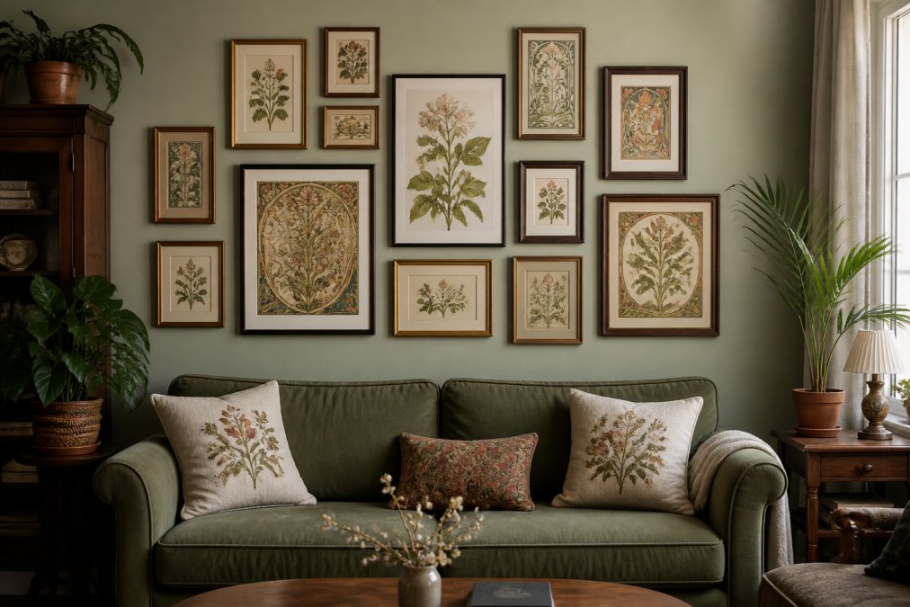
A gallery wall transforms a blank space into a personal art collection. The key is intentional curation, selecting prints that share visual or thematic connections rather than assembling random pieces.
For traditional living rooms, pair Morris botanical designs with Victorian-era prints. The shared colour palette and design sensibility create cohesion. Frame in natural wood or black to anchor the arrangement. A 5-7 piece gallery wall works well in this context, with frames sized between 230 × 305mm and 275 × 375mm.
Modern spaces benefit from gallery walls that emphasise graphic contrast. Mix botanical prints with mid-century illustrations or retro posters. Use consistent frame finishes, all black or all white, to impose visual order despite stylistic variety. This approach celebrates eclecticism whilst maintaining design control.
Bedrooms suit smaller, more intimate gallery walls.
Colour Palettes That Unify Your Wall Arrangement
Colour is the strongest unifying force in a gallery wall. Prints that share dominant colours feel connected even if their imagery differs. A gallery wall of botanical prints in jewel tones, emerald, sapphire, gold, creates visual harmony regardless of specific plant subjects.
Spacing and Wall Layout for Visual Harmony
The physical arrangement of prints matters as much as the prints themselves. Consistent spacing creates visual rhythm. A common approach is to maintain equal distance between frames, typically 5-8cm, which creates a grid-like appearance that feels intentional and ordered.
Print Size and Custom Options for Your Space
Selecting appropriate print sizes depends on wall dimensions, viewing distance, and surrounding décor. A small bedroom wall suits prints in the 230 × 305mm range. Large living room walls accommodate 275 × 375mm prints or larger.
Material Quality: Archival Paper and Longevity
The paper stock determines how well a print survives over time. High-quality reproductions use archival-grade paper that resists yellowing, brittleness, and colour fade. This matters because vintage wall art prints should look vibrant for years.
Caring for Original and Reproduction Prints
Proper care extends the life of vintage wall art prints substantially. Avoid direct sunlight, which fades colours over time. Position framed prints away from windows or use UV-filtering window treatments. Humidity fluctuations damage prints. Avoid damp spaces like bathrooms and kitchens.
Frequently Asked Questions
How do I know if a vintage wall art print is an authentic antique versus a reproduction?
Authentic antique prints bear signs of age: yellowing paper, subtle foxing marks, and wear consistent with their stated date. Reproductions are printed on modern paper with uniform colour and no aging. Reputable sellers like Antiquarian Print Shop disclose whether a print is an original or a high-quality reproduction. Original antique prints command higher prices due to rarity and historical significance, while reproductions remain affordable at £25-£50, making them ideal for gallery walls without investment concerns.
What are the best framing styles for antique prints to protect colour and condition?
Use archival-quality materials: acid-free mats, UV-protective glazing, and conservation-grade backing. Avoid direct sunlight exposure, which fades pigments over time. A matte finish reduces glare and emphasises fine detail in botanical and Art Nouveau designs. For prints with historical value, professional framing with spacers prevents the print from touching glass. The investment protects your print's longevity and enhances its visual presentation.
How do I create a cohesive vintage gallery wall with prints in different styles?
Start with a unifying colour palette: warm earth tones (ochre, sage, burgundy) work well with botanical and Art Nouveau prints. Arrange frames in a grid or salon-style layout with consistent spacing (5-8 cm between frames). Mix frame sizes and materials (wood, metal) to add visual interest while keeping finishes within the same tonal family. Include 2-3 anchor pieces (larger prints) and fill gaps with smaller botanical or retro designs. This approach creates visual harmony across diverse artistic styles.
What is the difference between vintage-style prints and original antique prints, and which should I buy?
Original antique prints are genuine historical artworks, often 50-150+ years old, created through traditional methods like lithography or etching. Vintage-style prints are modern reproductions inspired by historical designs. Originals offer investment potential and authentic historical connection but cost significantly more. Reproductions, such as the William Morris designs at $25-$50, provide the aesthetic without the investment risk, making them ideal for gallery walls and renters. Choose originals for collecting; choose reproductions for interior styling.